Overview
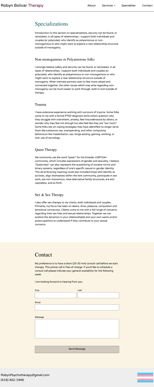
The goal is to determine how the Specializations section will appear. At this point, the key issue is how much written copy needs to be displayed. Once we know that, we can move onto issues of typography, color, icons, etc. Below are three options, although option #1 does not seem advisable, and is included as a starting point for the issue of longer copy.
The copy used is only supposed to illustrate how the page will appear, and any changes were not made for editorial reasons. For this task, it is better to ignore semantic aspects of text and just think about the layout. Also, for current purposes, the top nav, contact form, and footer can also be ignored.
Option #1: Long Copy
Display the full, long version.

Option #2: Show More / Show Less
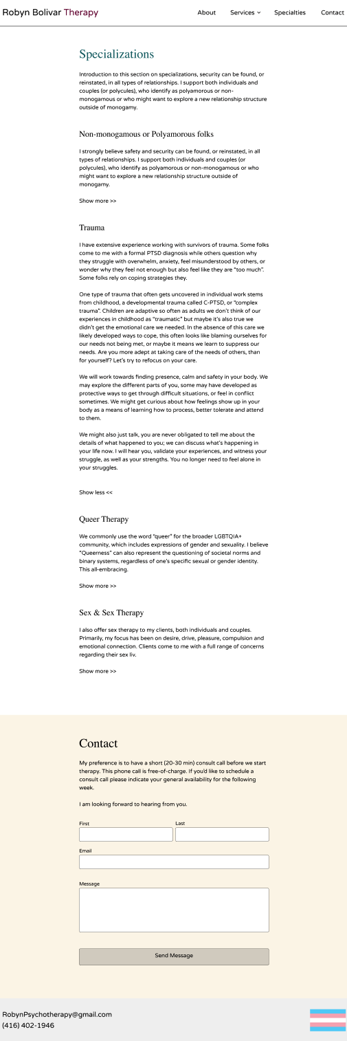
Option #1 does not seem advisable, and if the longer versions are going to be used the information should not appear as it does above. One way of displaying the longer versions would be to use a 'show more/show less' design. Other design patterns are available if the longer copy seems essential.
The two screens that follow show the initial page display, in which the 'show more' has not be clicked, and what will show after 'show more' has been clicked. Once 'show more' has been clicked, this text changes to 'show less' so the user can collapse the expanded text. The example screens below expand and collapse the Trauma section.
Initial Start Screen, with 'show more' options

Additional content displayed from Trauma section

Option #3: Succinct Copy
Rather than displaying extensive copy, the specialization desciptions could be edited down, and additional information provided by email or verbally.
Here is an example of what more succinct descriptions might look like.

Summary
The task is to decide between longer or shorter versions of the copy and, if longer, to decide how that longer copy should display
I don't know your field well enough to say what is best. That said, I lean towards the shorter versions with additional information delivered via other channels, although it's possible the addional information provided in the longer versions is critical for the user to understand the topics.